Laminate Flooring Samples for the Basement

14

Tuesday, March 25, 2014


After much deliberation (budget, practicality, etc.) we chose laminate flooring for the basement. I started writing this big, elaborate post on the pros and cons for different types of flooring in our basement. Then, a paragraph in, I got bored.
 
Let's just get to the pictures, shall we?
 
Here were the top three contenders.
 
Clockwise from Left:
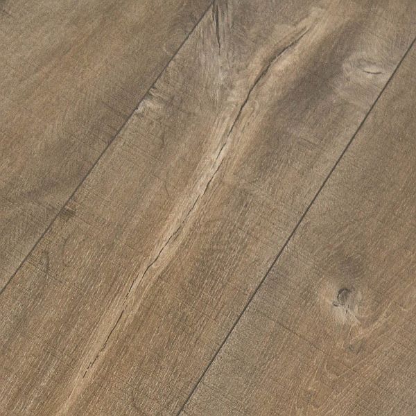
Largo Quickstep - Cambridge Oak
Richmond Laminate - Sapphire Mist
Quick-Step Reclaime - Mocha Oak
 
We finally decided on the Reclaime laminate in the Mocha Oak finish. It's a warm, soft brown color and has lots of texture. I'm still nervous about the decision because if I'm being completely honest I'm not really a big fan of laminate.


It was only after we placed our order that Alex found a picture of the same flooring installed in someone's kitchen. I was nervous to see it - crossing my fingers that I would like how it looked.


Phew! Looks pretty good.
 
The cement floors in our basement are so uneven that Alex has quite a bit of leveling to do before he can even think about installing the floors. But, at least we made a decision. 
 
Yay!
 
P.S. I was trying to avoid writing a really long, boring post but I ended up writing a short, boring one instead.
 
I'll make it up to you?
 
:)

Little Changes in the Living Room

18

Wednesday, March 19, 2014

I don't think I've ever shared many pictures of the other side of our living room. It was, and still is, a bit boring.
 
I moved a few things around today because I have a bad habit of leaving décor items in the same places for pretty much ever. I'm trying to be more adventurous.


We have a creamy white console table paired with a creamy white mirror against the small wall. All I have displayed on the console table is two matching white pots with two matching jade plants. It was all too matchy-matchy. So I went wild and crazy and hung my 'Peaches' sign over the mirror.
 
{In case you missed it, I bought the sign at the Christie Lake Antique Show one year because Alex's nickname for me has always been 'Peach'.}


I had a really pretty basket in storage that was supposed to be used for baby / toddler photo sessions. Except the base isn't wide enough and it sort of topples over. I try to avoid toppling baskets and babies so throw blankets in the living room it is!
 

I've been looking for the perfect thing to display in the stair landing. Since it's been, like, six years I've come to the conclusion that there is no perfect thing. So, I took the ladder that was in our breakfast room and stuck it there instead. Hmmm. I think I like it.


This little dragonfly isn't new. I just took a picture of it because I love it.


And in case you were wondering, yes, I did have to move all of the stray cars, blocks, Legos, and horses(?) to the other side of the room so that these pictures looked semi nice.

While I was taking pictures, Coops was doing some arranging of his own.


Hee hee!


:)

Couch & Armchair - Ikea
Jute Rug - Muskoka Living Interiors
Console Table - Homesense
Mirror - Home Depot
Sign - Christie Lake Antique Show
Ladder - Christie Lake Antique Show
Tray - Hilltop Interiors
Dragonfly - Pottery Barn
Basket - Homesense
Throw Blanket - Homesense
Barn Picture - Local Home Décor Store
Plants - Lowes
Plant Pots - Homesense
Paint Colour - Gray Owl (lightened by 50%) by Benjamin Moore

A Trip to Crate and Barrel in the Big T.O.

2

Monday, March 17, 2014

Alex, Coops, and I took a last-minute trip down to Toronto last week for the March Break. We had no real plans other than to swim in the hotel pool and to shop around a bit. Aren't those mini-holidays the best?!?
 
We braved a trip to Crate and Barrel with a fast and curious toddler. He flirted with all of the salesladies by showing them his "baba" (baby), taking his shoes off multiple times so that he could climb (and pretend to sleep on) the display beds, and watering all of the faux flowers in the store with a watering can from the garden display. 
 
:)
 
I fell in love with this mirror that was in their front window display. The online photo just doesn't do it justice. The colour in real life is much more of a rich, chocolate-y brown. I'm kind of kicking myself for not getting it while I was there and Alex was distracted by the baby who almost knocked down a whole display of wine glasses on glass dividers. We still have so many blank walls in our home that it could have fit in just about anywhere. Oh well.... maybe next time. :)

Frisco Mirror - Crate and Barrel


I did, however, manage to score a tiny metal grasshopper. It's pretty adorable. And it reminds me of spring which I am pretty sure is never, ever, ever going to arrive.

Cute Grasshopper - Crate and Barrel

And because I was supposed to be doing some planning for back-to-work last night I decided that it was the perfect time to learn how to add some textures in Photoshop. (I really am a professional procrastinator.)
 
This was my first try! It's just a picture of Coops' super long eyelashes. Now it's a scratched picture of Coops' super long eyelashes. ;) 


What have you been up to lately? Learn anything in Photoshop? Buy anything from Crate and Barrel? Come on, tell me. I'm procrastinating again, can't you tell?
 
:)

A Mirror for the Master Bedroom, Maybe

11

Monday, March 10, 2014

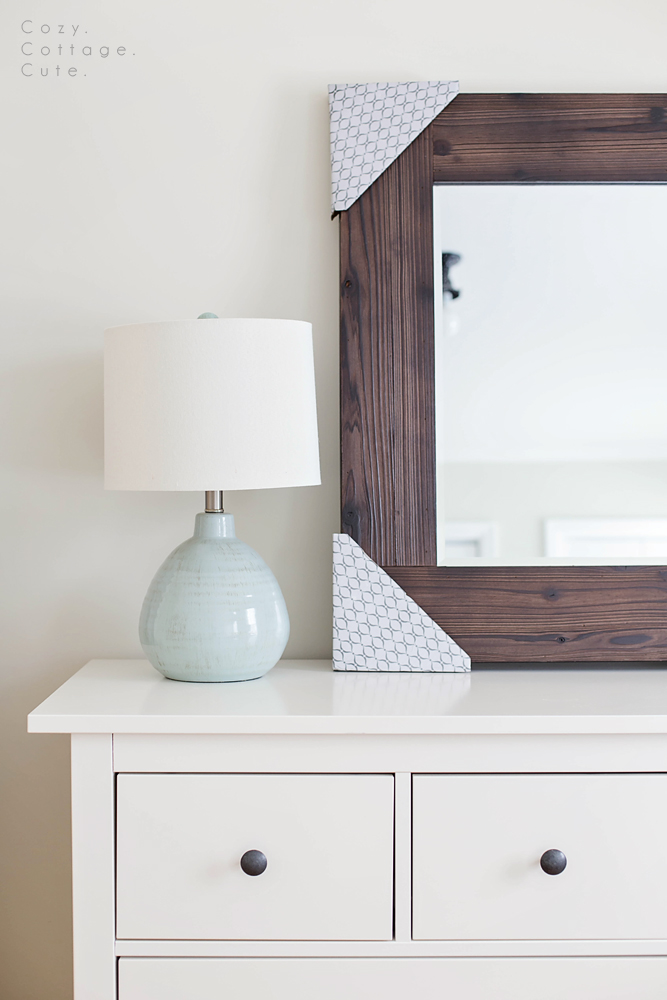
Ever since I started working on the master bedroom I knew I wanted to have a few antique, rustic, or wood elements in the room to add some contrast and texture. A few months ago we purchased the Hemnes 8-Drawer dresser for clothes and the Hemnes Shoe Compartment for socks and unmentionables, hee hee. We're really happy with how both pieces of furniture are functioning in the room but looks-wise they are pretty shiny and new.

See what I mean?

From the post about the new closet doors.
 
 
I thought about building a rustic mirror to hang over the large dresser. Kind of like this:
 
Source: Young House Love
 
But I didn't want to go to all of the effort to make a wood mirror if I wasn't 100% sure I would like it . I was also worried that a really dark mirror over such a light coloured dresser would look top-heavy. 

Kubu Mirror - Pier One Imports

I also wondered how a rattan mirror would look. They have a large, rectangular one online at Pier One Imports. However, when I went to see the mirror in person at my local store they didn't have them in stock yet. Also, the other rattan furniture from the series had a lot of little bits broken off and sticking out. Humfph.

From the post about the snowflake garland.

 
Then, I wondered how my large, windowpane mirror might look over the dresser. I got Alex to carry it upstairs for me (it's really heavy)(he was so thrilled). It looked really good, but not so good that I wanted to take it from the front entrance where it looks pretty awesome.

So, I waited.

Then, on a trip to look at basement flooring last Sunday we made a last-minute decision to stop in at Homesense on the way. That's when I spied a large, square, rustic, solid wood mirror. It was on display right at the store entrance. I casually walked over trying not to get too excited. But when a few ladies walked over and started to ooooh, awwww, and touch the mirror I started to panic. As soon as they stepped back I may or may not have pounced on it to bring to the register. I think it was fate.


Because the mirror is so dark, and because everything else in the room was so light for so long, it's still taking me awhile to get used to it. But, I'm pretty sure I love it.

On Photos That Didn't Make the Cut

15

Thursday, March 6, 2014


I call myself a wannabe photographer. I have one of those big, fancy cameras - but I am by no means a professional. While I think that my photos have gradually improved over time, they are still nowhere near where I would like them to be. I am trying to be patient and to learn with experience, however sometimes I can be my own worst critic.

Most days I will grab my camera while Cooper is playing to try and get that perfect shot of him - you know the one I'm talking about. The photo that is tack-sharp, perfectly exposed, has great composition and soft, natural lighting.

I'm not going to lie, it can be tough with a toddler! After I upload my photos I usually sort through them all to look for one picture that makes the cut - which I will occasionally share with friends and family on my personal Facebook page or post to Instagram to share with my Insta-friends.

I recently went back and read my goals for 2013. One of my main goals for the year was to take and enjoy more family photos whether they were "perfect" or not. And then I became disappointed with myself. My commentary as I go through my uploaded photos usually goes something like this, "Too dark, out of focus, hand is cut off, sun spots on the face, boring, bad lighting, etc., etc., etc."  

So this afternoon, I loaded up Lightroom and took a second look at all of the pictures that I took this week that didn't make the cut. And then something happened! I ended up liking some of them anyway - flaws and all.

Here they are:


Why I love this picture now: I remembered that Coopaloops just heard a snowmachine drive down the street and he climbed up on the chair to see if it was his Daddy. He said, "Dada? Vroom!"


Why I love this picture now: I remembered that Coops was clomping around in an old pair of my Roxy shoes while I was making dinner. And it was adorable.


Why I love this picture now: It's not often that toddlers like water poured on their heads, let alone pour it on themselves!


Why I love this picture now: I remembered that Coops was putting the tiny pot on the tiny stove to cook something for his Lego guy. And I heard him say to himself, "Hot! Hot! Hot!"


Why I love this picture now: I remembered that this is the first Size 2 outfit that Cooper has worn! (He's growing up so fast!) Also, when I showed him his new plaid shirt he said, "Dada!" and pointed to all of Alex's plaid shirts in the closet. 
 
 
--------------------------------------------------------------------------------------------------------------
 
 
From now on, I think I'll give all of my photos a second chance. What about you? Are you happy with your photography?

The Basement Fireplace Area is......Drywalled!!!

13

Tuesday, March 4, 2014

I am so excited. Like, so excited. The drywall is up in all of the main living areas of the basement and it looks soooooo gooooooood. (Let's just say that drywall is my bestest friend in all the world.) All of a sudden our basement renovation went from never-ending to I-see-a-light-at-the-end-of-the-tunnel-baby!
 
I thought I would focus on the fireplace area since we need to start making some decisions on how we're going to finish it. Here are some renovation pictures just to reiterate how far we've come!
 
 
Close your eyes, girls! Alex is showing some leg!

Woah. That is all I have to say.


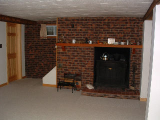
I know I already shared this photo recently but here is the real before picture. It was taken from the real estate listing before we bought the house. I apologize for the poor quality!


Here is how that wall is looking as of yesterday! Woot woot!


These are some of the major changes we made to make the space work (ahem, look) better for us:
 
- took down the dropped ceiling and replaced it with a drywalled ceiling
- took down track lighting and installed pot lights
- removed the mantle
- removed the half brick wall and replaced with drywall
- took out the raised hearth
- moved the fireplace opening to the left (away from the wall)
- took down part of the stair wall so that the stove is now centered
- replaced the window
- replaced the solid door on the pantry with a frosted French door
 
While the fireplace itself hasn't quite been figured out yet, we did make some final decisions on three things: wainscoting, interior doors, and exposed beams. I'll share more details about those three decisions tomorrow!
 
P.S. Even though I tease Alex about the basement renovation taking a really, really, really long time, I am actually super duper proud of him and all of his hard work. He renovates, does laundry, and downloads all of my favourite shows. He's my hero.
 
P.P.S. This post is getting a tad on the mushy side. I'm out! ;)
Related Posts Plugin for WordPress, Blogger...

Cozy.Cottage.Cute. All rights reserved © Blog Milk Design - Powered by Blogger