Kids Room - Adding Some Accent Colours

21

Thursday, January 29, 2015


I can't believe that my little dude is already sleeping in his new, big boy room. I was so excited for him that I didn't really have a chance to process what a huge milestone it was. That is, until I peeked into his old, half-empty nursery that very first night. Where did my little, chubby-cheeked ninja baby go!?!?!?


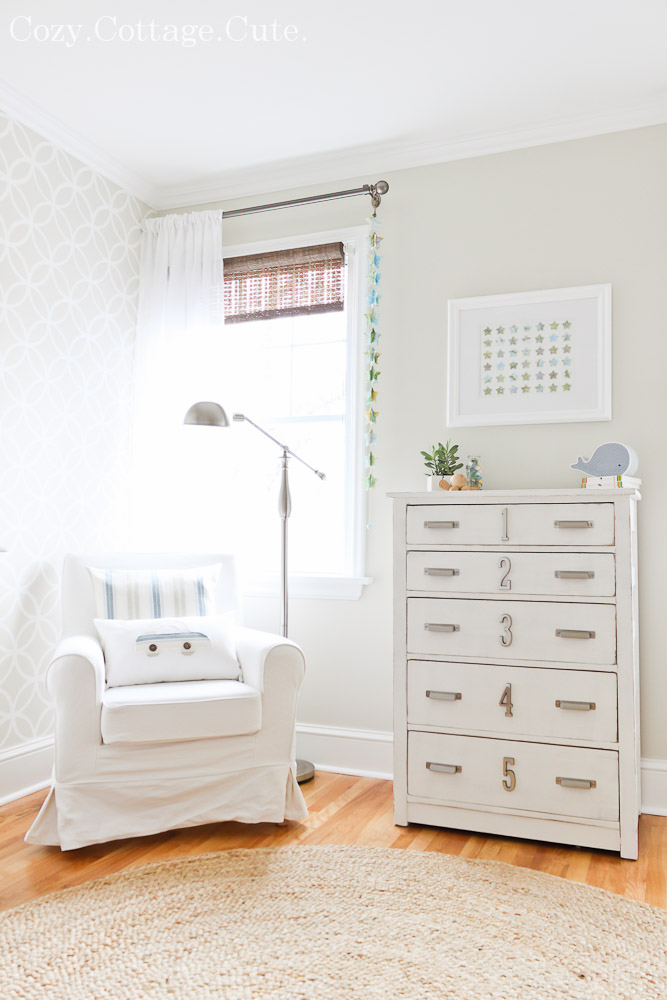
Over the past few months I've been slowly moving things out of the spare room (it's official - I'm a hoarder) in order to move some of Cooper's stuff in. To make it a smooth transition I moved some of his familiar furniture with him into his new room. Here's what I hauled over.

His bookcase (minus the baskets because they're corralling toys in our sunroom):


His armchair for story time as well as his dresser for clothes:


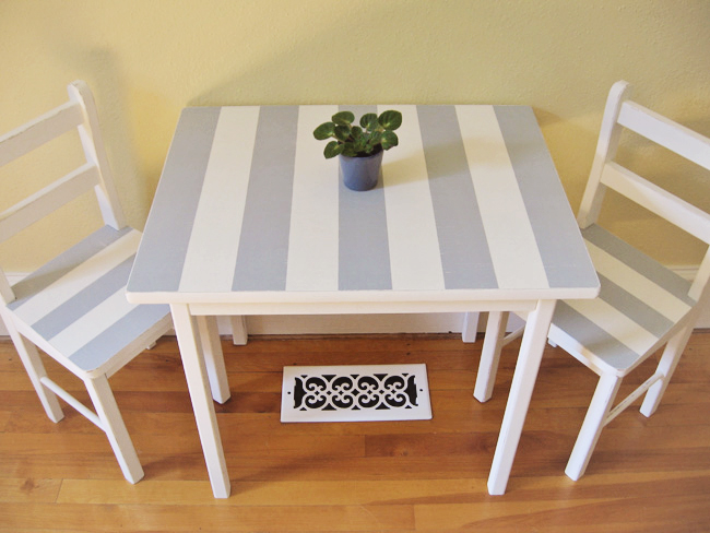
I also brought in a kids table and chair set that I painted many moons ago (when I painted my house with fluorescent yellow paint by accident)(this picture still scares me):


The table and chair set will be getting a simple makeover to avoid stripe overload. I love me some stripes, but I don't want to go too crazy with striped walls as well.

I explained in a recent post that I'm working with the horizontal stripes that were already in the room. That decision has it's pros and cons. It's a lot less work if I don't have to sand and repaint an entire room. To be honest though, I'm kind of over the paint colours. Let's just say that if I were starting from scratch I would probably choose a different wall colour. I still like it, I just don't love it as much as I did way back when.


After making a bland and boring design board thingie I decided that I would need to liven up the room a little bit.

Bland and boring design board thingie:


I decided that I would try to incorporate a few accent colours. This was so hard. You know me. I like the colour white.

The colours I started with included:


Simply White - Benjamin Moore
Old Prairie - Benjamin Moore
Camouflage - Benjamin Moore
Kendall Charcoal - Benjamin Moore

After a lot of deliberation (and anxiety)(things like this stress me out)(I'm weird like that) I finally decided on the addition of two accent colours.

Here they are altogether.... dun dun dun......


Westcott Navy - Benjamin Moore
Palladian Blue - Benjamin Moore

Here's my new plan for the room incorporating a little bit of navy and light blue:


I am loving the look of everything together in the above picture, I just hope it will look nice together real life. Eeeeeek!

What do you think? Love it or hate it? Any suggestions? I'm all ears! :)

The Basement - A New Console Table

11

Wednesday, January 28, 2015


We've still got a lot of work to do in the basement. There are finishing details to work on (Alex) and decorating details to work on (me). I know, I know...... I totally divvied up the work fairly. 

Last weekend Alex was filling nail holes in the baseboards and caulking all of the trim. I was twiddling my thumbs waiting for the a-okay to bring our super cute new console table downstairs.

You see, as you are coming down the stairs there is a little nook in front of the pantry.  


As you can see from the floor plan, it's kind of an awkward spot. 


I wasn't really sure what to do with it until I came across an adorable, cottage-y console table at Homesense. It's got two little drawers, cute black hardware, a distressed white base, and a rustic wood top. 

Yup, it was meant to be mine.


At first I thought I would try and find a rattan desk chair to tuck under it, however since we're planning on having a built-in desk area elsewhere in the basement, I'm thinking some large storage baskets underneath would be cute and functional. Large baskets for throw pillows and throw blankets are a must - especially when we finally, after four long years, get to have movie nights with a real t.v. and fancy surround sound!!!

------------------------------------------------------------------------------------------------------------

In other news, I'm trying to savor every last little moment of one-on-one time with my little guy. Only three months left, people. Three. {PANIC FACE!} In this picture, we are slurping hot chocolates together after a long walk in the fah-reezing cold. 


And yes, I am fully aware that my child was starting to resemble a certain Disney character named Mowgli.


It's all good now though. After procrastinating for weeks, we finally made it to the hairdressers this afternoon. :)


The Basement: Beams VS No Beams

4

Wednesday, January 21, 2015


Hiya. I'm taking a few minutes to rest (and blog!) since I've got an itchy, scratchy throat and I'm pretty sure this is my fourth cold since Christmas. {Insert pathetic self-pitying cry here.} I'm pretty sure the only thing that will make me feel better is a hot chocolate with no less than three marshmallows. I'm prescribing myself one as we speak.


During our basement renovation I must have pinned a zillion inspiration pictures. There were some design features that I was sure would get incorporated into our finished space. 

Example #1: Board and Batten Wainscoting

Source - Beach House in the City

In order to save valuable time and effort we nixed the wainscoting in favour of fully painted walls. You can read all about that decision in my last post here.

Example #2: (Faux) Rustic Wooden Beams

Source - Unknown

The previous owners of our home had two exposed support joists running along the basement ceiling. They were clad in pieces of thin, stained wood which gave the illusion that they were big, original, wooden beams. I thought we could replicate the look (but even better than the original version) to add some interest and cottage rustic-ness to an otherwise light space. I even thought about DIYing a cool whitewash treatment over them. When Alex dry-walled the basement he left the joists exposed with the full intention of creating the faux rustic, wooden beams that I reallllllly wanted.


However. However. When it came time to actually start creating the look of wooden beams, it became clear that we didn't really think it through. Alex couldn't find any wooden planks that were wide enough to cover the bottoms, the ceilings are not level which would leave giant gaps in some places between the wood and the ceiling, and the sides were longer than a standard board size so it would require a lot of puzzle piecing. It didn't help the situation that my "beams" were the last thing to complete before Alex could tackle the flooring. And they were starting to hold up his progress big time. Once I could see that his frustration levels were rising to dangerous levels I told him I would be okay with dry-walling them instead.

So he did. 


While I still think that wooden beams would have looked really cool, it ended up saving us quite a bit of time and energy to make them dry-walled bulkheads instead. Even I will admit that it looks really clean and polished down there now.

AND, most importantly, the hubs is no longer grumpy with me.

:)

A Change in Plans for the Basement Walls

14

Wednesday, January 14, 2015


If you've been following along on the longest basement renovation project of all time, you may recall that the last pictures I shared of our basement were of freshly dry-walled, primed, and painted walls. The top half of the walls were painted in Benjamin Moore's Silver Satin, and the bottom half of the walls were painted in Benjamin Moore's Simply White. At the time I was pretty dead set on having board and batten style wainscoting all throughout the basement.

Ahem. Change of plans.


The sudden change of plans happened when I submitted a photo of our fireplace to the lovely Layla at The Lettered Cottage. I was really hoping she could work some of her Photoshop magic to help me visualize how we could create a mantle surrounding a freestanding wood-look stove (you can read the post about that dilemma here).

Layla's Photoshop mock up was pretty awesome. She threw me for quite the loop though because I was not expecting either of her main suggestions! She suggested that instead of making a traditional mantle we use vertical paneling on the whole fireplace surround. She also suggested that we ditch the wainscoting for fully painted walls to make the basement appear taller.

{Check out the before and after inspiration pictures here in Layla's Pick My Presto post. So fun!}

It was hilarious when Alex read Layla's suggestions. He pretty much did the biggest happy-I-told-you-so-dance I've ever seen. You see, with so much finishing work still left to do in the basement, he was really overwhelmed with the idea of adding a huge wainscoting project to the list. It's also not the easiest space to work in since there are posts to work around, about ten thousand outlets and speaker holes to allow for, and lots of inconsistencies in wall depths and heights. 

So, as soon as he heard these words utter my lips, "Hmmmm, maybe Layla is right", he ran downstairs and repainted the basement walls before I could blink. What a guy.

Now we have all of the walls painted in Silver Satin by Benjamin Moore. 

Here is a most recent progress picture:


I'm absolutely loving how things are coming together. Now, I most definitely need to come back and explain why I haven't shared more basement progress pictures (ahem, floors!?! ahem, trim!?!? ahem, frosted french doors1?!?).

I also plan to share a few more changes we've made to our original plan in order to simplify things and, well, speed 'em up a little too!

---------------------------------------------------------------------------------------------------

In other news, the things my little stinker says / does are becoming more and more hilarious by the day. I know everyone says this about their kids but man, he is such a funny little character! And if you couldn't tell from the picture, he has been taking his pirate duties very seriously these days.


L8R SK8R.

I have no idea why I just wrote that. ;)
Related Posts Plugin for WordPress, Blogger...

Cozy.Cottage.Cute. All rights reserved © Blog Milk Design - Powered by Blogger