Oh hi. Here is that tutorial I promised on how to make a grocery sign. (You can find the original sign post here as well as my sign inspiration post here.)
Here's how the sign-making business went down.
Materials:
- Pine board, cut to size (I used a 5' piece of 1x8 pine)
- Mitre saw
- Foam brushes (I used three)
- Stain or paint for the base colour (I used Varathane Gel Stain - Special Walnut)
- Paint for the letters (I used Benjamin Moore - Cloud White)
- Microsoft Word, paper, scissors
- Scotch tape
- Painter's tape
- Yardstick
- Measuring tape
- Permanent marker
- Sander (I used a Craftsman orbital sander)
- Sandpaper (I used 100 grit)
- Sharp objects to ding/dent wood
- Glaze (I used Behr - Faux Glaze)
- Tint for glaze (I used a sample pot of Behr - Expresso Beans)
- Mounting hardware, nails or screws
Directions:
First, I purchased a five foot piece of 1x8 pine from Home Depot. I measured my window (and window trim) and decided that I wanted my sign to be the exact same width. I got Alex to cut the board down to size using a mitre saw:
 |
| Pine board from Home Depot cut to length. |
Once my board was ready, I chose my base colour. Instead of paint, I decided to use wood stain to add a bit of contrast in my all-white and light gray kitchen. I really like medium or chocolate brown stain so I used Special Walnut by Varathane which I already had on hand from a different project. Using an inexpensive foam brush from Home Depot, I brushed the stain onto the front, back, and edges of my board. I left it to dry overnight and then added a second coat of stain the next day:
 |
| Two coats of Special Walnut stain. |
For me, the hardest part of this project was deciding on a font style and size. I typed the word "grocery" onto a Microsoft Word document and then changed the font a hundred times until I decided on Century Gothic in all capital letters. I liked how the letters were really simple and round, it reminded me of how a real grocery sign would look. I played around with the font sizes and finally decided on using font size 600. I printed each letter onto a plain white piece of paper and then cut them out. Once I had my paper letters cut out I laid them out on top of my board to make sure the size and spacing looked right:
 |
| Paper letters laid out on board. |
Since I'm terrible at free handing letters and didn't have plastic stencil material or a Cricut / Silhouette machine, I decided to try a new way of stenciling. I took out a roll of painters tape and used four long strips to fully cover my board.
 |
| Painter's tape covering board. |
I placed my letters back on the board over top of the painter's tape. I used a yardstick to draw a line along the bottom of my board so that the letters would be straight:
 |
| Letters aligned and spaced out on board. |
Once my letters were in the right places, I used two tiny bits of Scotch tape per letter to keep them in place. Using a permanent marker, I carefully traced around each letter. Then, I removed the bits of tape and paper letters so I was left with an outline of my letters:
 |
| Letters outlined with permanent marker. |
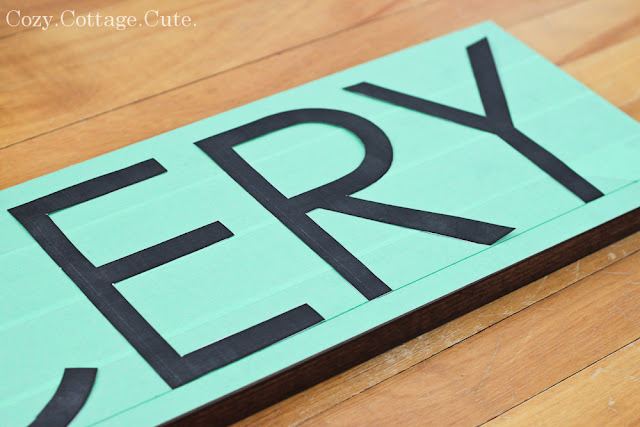
Next, I used a sharp craft knife to slowly and carefully cut along my marker lines. Once I finished cutting around each letter, I carefully peeled up the tape inside of each letter:
 |
| Letters cut out using a craft knife. |
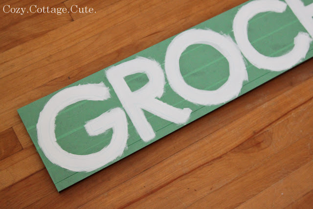
Once my letters were all cut out, I made sure to rub down all of the remaining tape so that paint wouldn't bleed underneath. I used a tiny foam brush and gently dabbed on my contrasting paint colour. In this case, I chose white lettering and used some leftover white paint from a previous project. I made sure to dab the paint on for the first coat so that again, it wouldn't bleed under the tape. For the second coat of paint, I was able to just brush it on:
 |
| Two coats of paint. |
After a few minutes, I started peeling the tape off, strip by strip. I made sure to do this once the paint was still slightly wet.
 |
| Tape peeled off. |
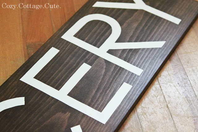
The strips of tape came off really easily and left beautifully crisp paint lines:
 |
| Nice crisp letters. |
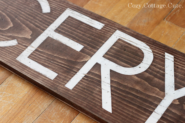
Once the paint was dry I used an orbital sander with 100 grit sand paper to give the sign a distressed appearance. I also used a hammer and screwdriver to bang a few dings and dents into it:
 |
| Distressed with an orbital sander. |
After hanging the sign up in the kitchen and sharing some photos of it in this post, I decided to add one final step. I decided to add a bit of brown glaze over top of the sign to darken the wood back up (lots of stain came off with sanding) as well as to tone down the bright white letters. I mixed some of Behr's Faux Glaze with Behr's Expresso Beans paint with a ratio of roughly 3 parts glaze to 1 part paint. Once mixed, I spread the glaze over each letter with a foam brush and let sit for a minute. After the minute I wiped off the glaze with a damp paper towel:
 |
| Glazed. |
I knew that the glaze wouldn't make a drastic difference because it was brown glaze on brown stain. However, it did the trick of settling in some of the dings and dents, darkening the wood a bit, and toning down the bright white letters. A subtle difference but a step that I'm glad I did.
I also raised the sign up about an inch from it's previous spot. Here it is again above the kitchen window:
P.S.S. Who thinks our main floor floors need to get refinished ASAP? Me! Me! Me! Me!
P.S.S.S. It's the last day to enter my Shabby Apple giveaway if you haven't already. ;)
P.S.S.S.S. I like the new sign but I still hate our needs-to-be-gutted-so-badly kitchen.
P.S. I did a project, start to finish. It's a miracle!
P.S.S. Who thinks our main floor floors need to get refinished ASAP? Me! Me! Me! Me!
P.S.S.S. It's the last day to enter my Shabby Apple giveaway if you haven't already. ;)
P.S.S.S.S. I like the new sign but I still hate our needs-to-be-gutted-so-badly kitchen.


I actually really like your kitchen. It's better for the environment to re-use than gut anyway so consider yourself a friend to the planet.
ReplyDeleteI love it!!! What a great job you did on it, your kitchen is so sweet and cozy! Love the instagram too!
ReplyDeleteLovely sign. Just. Love.
ReplyDeleteSo adorable. I am having a candle giveaway, feel free to stop by. Hope you have a wonderful week.
ReplyDeleteYour sign came out great! I'm never able to get clean lines with painter's tape, but yours are perfect. Love it.
ReplyDeleteCindy
That is a BRILLIANT idea for creating a sharp, clean edged image, Sarah!!! Love it! Thanks so much for the tutorial. Your sign looks just fabulous there!
ReplyDeletexoxo laurie
So simple! Love this and I think it looks great above your window.
ReplyDeleteI love your sign and your unique way of stenciling is great, I may have to try that out! I am busy doing some new stuff in my kitchen and was thinking I need a "grocery" sign, I may use your technique!
ReplyDeleteYour floors look just like mine! LOL! Mine need to be refinished too but the thought of moving all the furniture out of each room kills me! LOL! And I LOVE your kitchen, I would gladly trade mine for yours! It's very cozy... cottage... cute!! :o)
Tania
Awesome!!! Such a good idea to use the tape as a stencil!! This has limitless possibilities. Now if only I could start and finish a project:( Tell Cooper I say hi!
ReplyDeleteSarah, I love all your DIY projects! You are amazing to get anything done with a baby :) Your sign is awesome...and Cooper is adorable!!!
ReplyDeleteSarah, I just found your blog and I am in love with your simple style and your many tutorials! i just got lost in your blog checking everything out! I am Canadian too and your newest subscriber. :) Cant wait to catch up on all that I have missed and to follow along!
ReplyDeleteOh I adore this sign and really would love to tryout your tutorial! Thanks so much for sharing!
ReplyDeleteHi Sarah,
ReplyDeleteLove the sign, it is perfect for the space! Your attention to detail in your tutorials is fantastic!
Thanks for sharing this tutorial! It turned out so lovely! Def inspires me to try :)
ReplyDeleteLove this idea! Thanks for sharing sarah :)
ReplyDeleteGreat work Sarah! Smart idea to use the painter's tape. It turned out nice and crisp.
ReplyDeleteI don't have a silhouette either! We might be the only bloggers left who don't have one. Not that I'd be opposed to one! I like your method and I just might try it.
ReplyDeleteAnd your sign looks AWESOME.
:) Erin
Seriously, the way you did this with the painter's tape is GENIUS!! I would have NEVER thought to do it that way!! I am thinking about making a sign for our new bathroom! I might just give this method a try! Thanks for sharing Sarah!
ReplyDelete